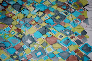
sense of power and status, my interpretation of animal skins looks vibrant, clarified and refined. The satin on the left looks far more beautiful than the silk twill, left. Which is essential to the appeal of my designs.


Noticing that the animal prints have the most impact and my colour use is looking the same and need to keep the colours separate instead of using all of them. I printed and part constructed a top with georgette in the middle, and recreating a print from the sk

etch book using masking tape to section strips out and then painting back in, using a hint of purple to give a punch and variation. The georgette also give variation whilst enhancing the linear design.
By constantly reviewing, evaluating and referring to my print work and sketchbook I can ensure that the collection is looking refreshing, vibrant, feminine and variable.
No comments:
Post a Comment