I wrote my first article for Velvet Magazine, at cubiq today- 'Beauty Stalker' To be part of a big professional team is very exciting. Also to receive have positive feedback from the editor was a huge compliment. The magazine is edgy, young and ambitious, so its a very influential place to be- Next week I'll be on location doing photo shoots with tom.... very exciting.
Ive split my sketchbook into 3 main inspirational routes/ sections:
1. Skins and Skeletons
2. Gargoyles and Mythological Creatures
3. Crests and Gilded Frames
Reflecting on my work (yesterday, this morning and evening) I feel successful with the amount of progress made. Its developed from a sketch book of drawings into a fashion design process. I've taken my drawing as inspiration for making patterns and placements prints on dresses. I would like to make 4 fronts for each collection.
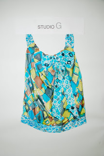
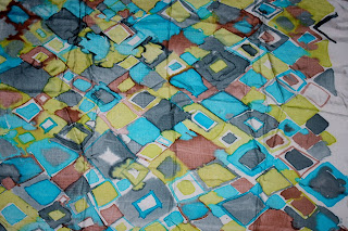
In the skeletons and skins section there are 3 very successful designs with a few that can be collaborated and tweaked. This collection focuses on symmetrical prints. I want to use discharge printing and photoshop/ digital printing to create my McQueen, Angelo and Piloto inspired prints. The rich colour palette of greens, aqua, greys and browns, is also inspired from McQueens S/S 10 Collection.
My next section is gargoyles and mythological creatures. This is focusing over sized, placement printing and symmetrical prints, with the possibility/ option to embellish sections. Gargoyles are protecting my garments in very aggressive poses. Kane and Sui have largely influenced my designs- varying from intense sharp imagery to cartoon/ colloquial looking designs. The colour palette is drawn from the stone carved gargoyles themselves; boasting a strong colour palette of greys, blacks and white.
I feel confident and excited to start producing these into finished, refined products.
I'm also excited to start discharge printing tomorrow.


 which was very enjoyable. Setting up a production line doing 3 patterns at once. I was doing the only the top half of my designs to practice and perfect my technique with screen printing. But was still feeling messy and long-winded with the way in which I
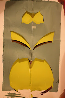
